Visual language for Google maps
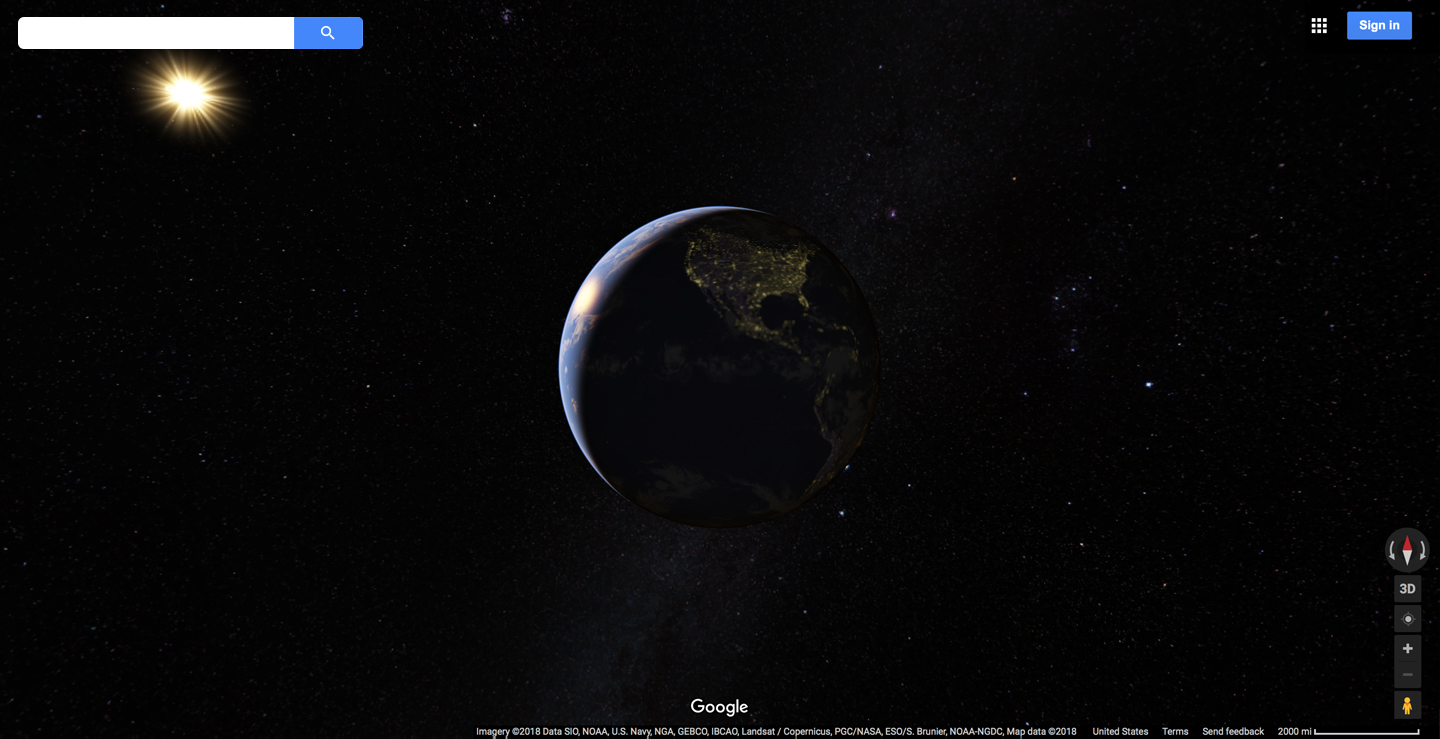
Maps: Metaphor of our world
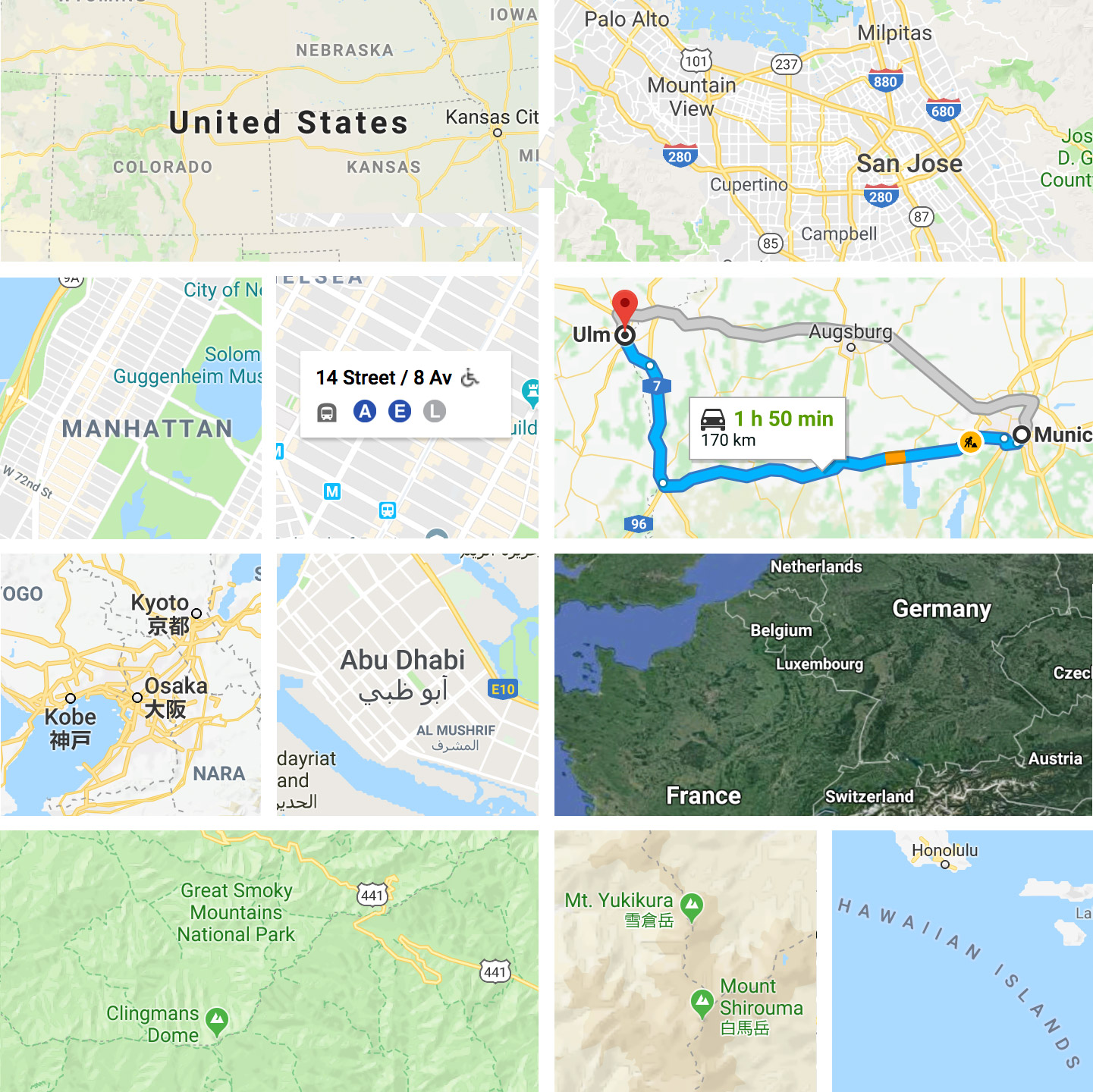
Google maps cover 196 countries, across 21 zoom levels, available in 22 different local languages. The biggest challenge in design is defining an ultra scalable visual system, including typography, color, and iconography for presenting the mountain, ocean, reef, fjord, island, glacier, roads, transit network, built-up-areas, point of interest, 3D building, indoor floor plans, etc. In short, any feature on this planet we live. The designs have to work on desktop, tablet, mobile phone and wearable devices.
Google maps cover 196 countries, across 21 zoom levels, available in 22 different local languages. The biggest challenge in design is defining an ultra scalable visual system, including typography, color, and iconography for presenting the mountain, ocean, reef, fjord, island, glacier, roads, transit network, built-up-areas, point of interest, 3D building, indoor floor plans, etc. In short, any feature on this planet we live. The designs have to work on desktop, tablet, mobile phone and wearable devices.
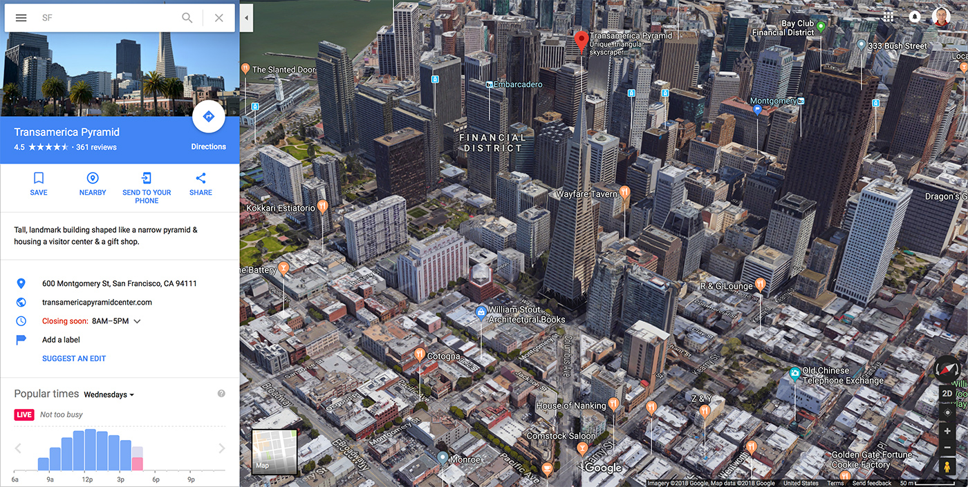
Google maps 2D and 3D
Combining the data, aesthetics, and rendering technology, our design solution builds on the premise that reality can be modeled in ways that communicate spatial information effectively. As designer, our mission is not just helping user get from A to B with great confident, but it also help the user to discover the beauty and diversity of the world, either a 2D bird-eye view or 3D perspective, either cartographic or through the user generated imageries.
Combining the data, aesthetics, and rendering technology, our design solution builds on the premise that reality can be modeled in ways that communicate spatial information effectively. As designer, our mission is not just helping user get from A to B with great confident, but it also help the user to discover the beauty and diversity of the world, either a 2D bird-eye view or 3D perspective, either cartographic or through the user generated imageries.
Typography
To help user read and understand the map content easily, legibility and info clarity always remain the focus of the design. Map typography visualizes of the order and the relationship of the geographical information. It is extremely challenging to create a scalable labelling system, defining each maps features lifespan through out the zoom levels, and applying it to the various urban/rural densities of the world.
To help user read and understand the map content easily, legibility and info clarity always remain the focus of the design. Map typography visualizes of the order and the relationship of the geographical information. It is extremely challenging to create a scalable labelling system, defining each maps features lifespan through out the zoom levels, and applying it to the various urban/rural densities of the world.
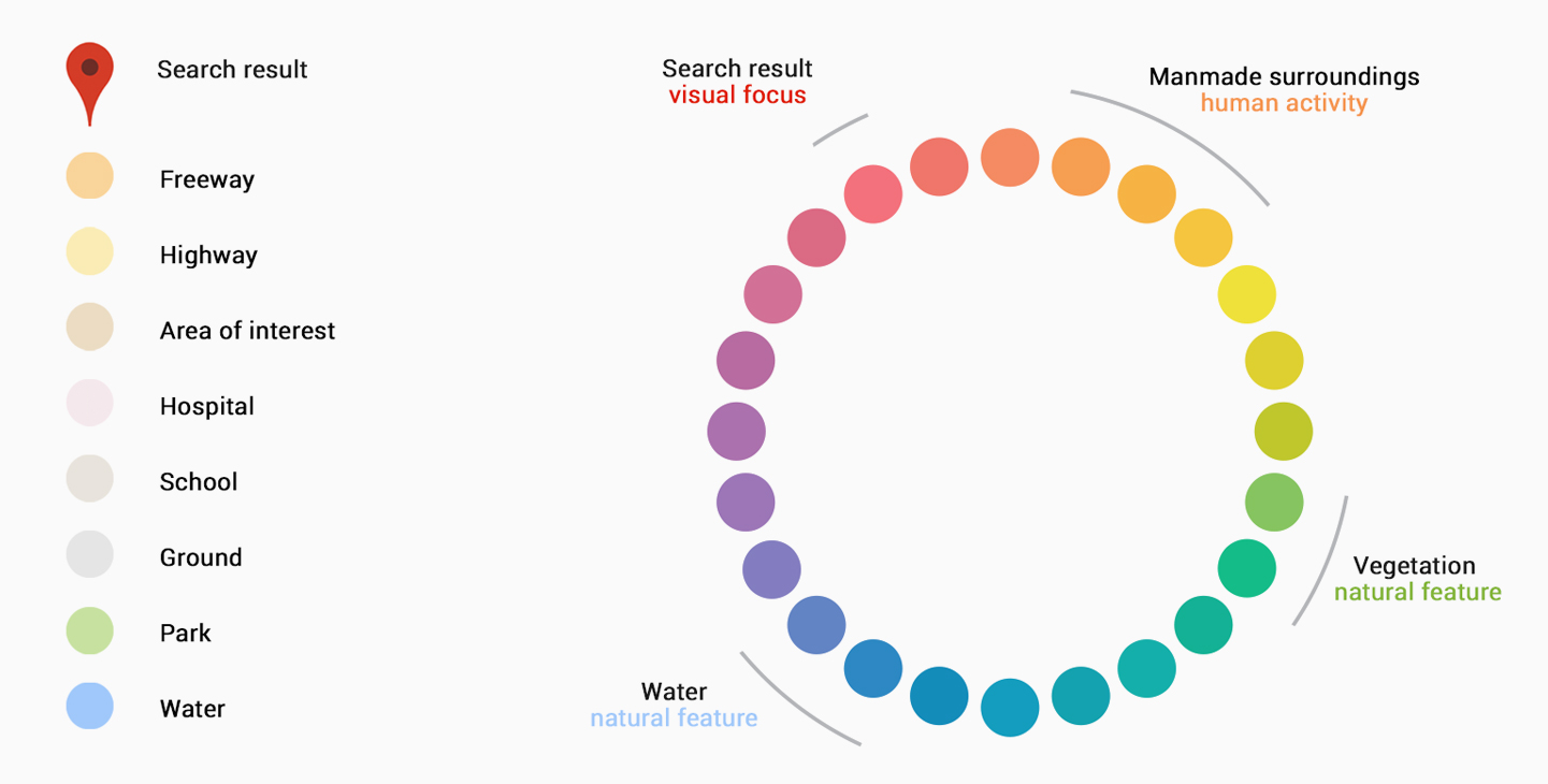
Map color system
Carefully selected color palette enables efficient information classification and aesthetic pleasant. Good design is natural and invisible, just like the water and air purity, the least we notice the design, the better.
Carefully selected color palette enables efficient information classification and aesthetic pleasant. Good design is natural and invisible, just like the water and air purity, the least we notice the design, the better.
Iconography
Iconography, as the most universal language to represent the various types of the map features, from to Points of interests, orientation landmark to local businesses.
Iconography, as the most universal language to represent the various types of the map features, from to Points of interests, orientation landmark to local businesses.
Less pixels, more information.
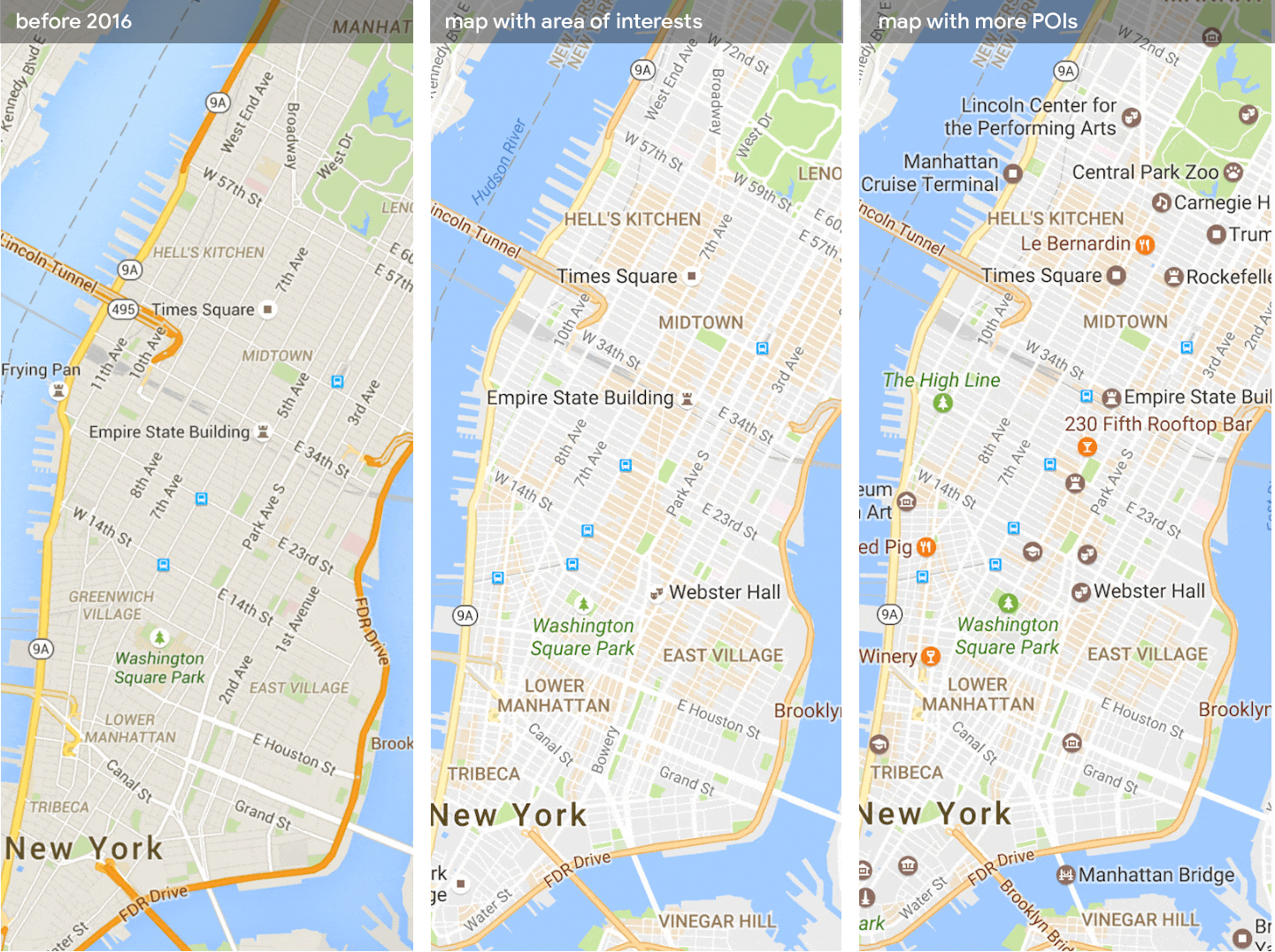
I designed and witnessed the map style evolution of Google maps. It is all about creating an elegant design langauge to support growing data without scarificing the visual simplicity. In 2016 to 2017, i was leading a major redesign of the map, aiming a cartographic exellence, by bringing more meaningful content to our user while removing all the non-data visual elements, to maximize the information to pixel ratio. We launched the - Area of interest at the same time. See Google blog post, this feature is detailed documented by a third party as Google maps Moat.
I designed and witnessed the map style evolution of Google maps. It is all about creating an elegant design langauge to support growing data without scarificing the visual simplicity. In 2016 to 2017, i was leading a major redesign of the map, aiming a cartographic exellence, by bringing more meaningful content to our user while removing all the non-data visual elements, to maximize the information to pixel ratio. We launched the - Area of interest at the same time. See Google blog post, this feature is detailed documented by a third party as Google maps Moat.
"Now, what are good design comparison sets for workaday diagrams and data displays?
Well, put your display pairwise adjacent to the most widely used data-architecture in history: Google maps. "
- Edward Tufte
Last update: July.2018, in Seattle
All rights reserved.
All rights reserved.